Which of these four 2018 Colors of Year is your favorite?
It seems fitting that experts make their selections for the annual color of the year in fall. Simply step outside your door and beautiful ambers, cinnamons, mangos, and mossy greens surround you; you can’t help but be inspired. Fashion and decorating enthusiasts anxiously await the announcement of the color of the year and this year, the selections don’t disappoint. The winners for 2018 are all over the rainbow! Often there are some similarities between at least two of the top picks, but not this time.
Today we are going to show you the color of the year selected by four different paint companies. Each group looks at slightly different influences to determine their color choice and provides some insight into why they made their choice.
AkzoNobel/Dulux Paint – Heart Wood

Heart Wood is the quietest shade of the bunch. AzkoNobel calls it a “grown-up pink” that echoes the look and feel of natural wood and leather. If you aren’t familiar with AkzoNobel, they are a paint and coating company headquartered in Amsterdam.
The firm’s Global Aesthetic Center works with design and color experts around the world who look at technology, art, design, nature, architecture, and even fashion and music before selecting a color of the year. This year they felt that people around the world are looking to escape the noise of everyday life when they are at home. Heart Wood brings that sense of calm, relaxation and solace.
PPG Pittsburg Paints – Black Flame

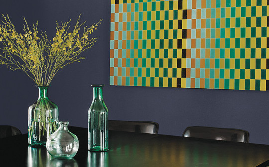
To select PPG’s color of the year, the global paint company has their top 20 color experts from all over the world meet together for 3 days to present and debate their selection. This year, they crowned Black Flame and claim it will be the “new neutral”.
Black Flame is black with a hint of deep indigo. This shade was selected to satisfy consumer’s need for privacy, optimism and a search for things classic yet modern. This color fits the bill. It’s timeless like the little black dress; it looks great on everyone and provides a great canvas to highlight other colors and accessories. This idea translates perfectly into interior decorating.

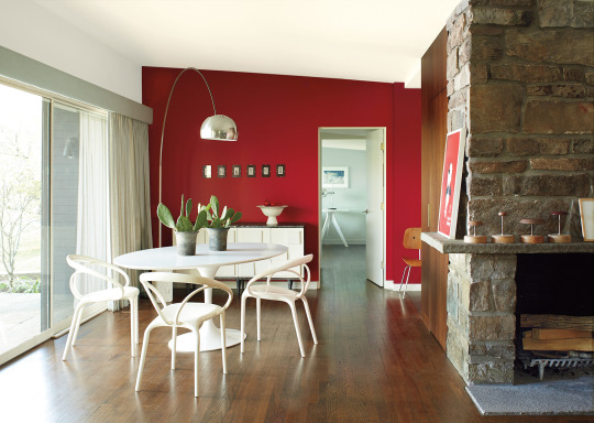
Caliente is the wild card of the bunch. This bold, energetic red is a bold choice. Benjamin Moore takes months to examine research from industry shows, fashion, and architecture seen around the globe. Red was seen prominently; in January’s Women’s March in Washington DC, in popular TV shows like The Handmaid’s Tale, and in Stockholm Royal College of Music’s concert hall.
Caliente has a slight brown undertone, so it’s not a simple primary red. It evokes a sense of change, strength, and confidence. Use it to create a strong focal point or a lasting impression.
Sherwin Williams – Oceanside

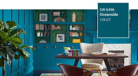
Oceanside is a gorgeous deep teal, almost a jewel tone. Reminiscent of the ocean and inspired by global travel, Sherwin Williams believes it will satisfy a homeowner’s search for adventure in a shade that is a balance of old and new.
After examining influences from all over the world, their experts selected Oceanside for its versatility. It’s suitable for traditional spaces as well as modern and invites a sense of clarity and is known to boost creativity. This is a color you can bathe your walls in or use more deliberately for pops of interest.
Which one is your favorite?
As you can see, there is no shortage of options and there’s certainly a color for every mood. Are you inspired to bring some color into your life? Can you picture it in one of your rooms? Envision Heart Wood in your living room creating a cozy and warm space to relax or perhaps an Oceanside accent wall in your home office to keep your creative juices flowing. If you’d like assistance navigating the color rainbow, we invite you to call us to schedule an expert color consultation. We would love to help! Call 203-405-2126 to find your local Decor&You or go to www.decorandyou.com