Navigating This Year’s Color Trends.
Navigating This Year’s Color Trends.
Every year, fashion and decorating enthusiasts anxiously await the announcement of the color of the year. The problem is, with multiple reputable sources making predictions, which do you believe? Pantone, the world-renowned authority on color? Benjamin Moore, industry favorite paint company that’s been around since 1883? Each group looks at slightly different influences to determine their color choice. For all you color lovers out there, we’ve put together this 2016 color trend guide.
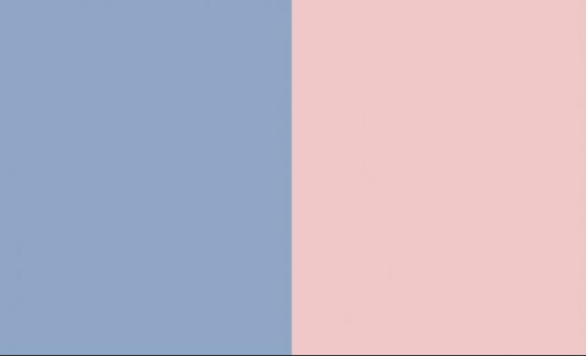
Pantone – Serenity Blue & Rose Quartz
For the first time ever, Pantone selected two colors of the year. If you close your eyes and imagine a beautiful sunset, you can visualize these two shades melding beautifully together. Serenity blue is a pale tranquil blue, like the sky on a clear day. Rose Quartz is a nude pink, similar to the gemstone.
Pantone looks at many influences including fashion, the entertainment industry, art, design, popular travel destinations, and even current lifestyle trends and socio-economic conditions. Serenity Blue and Rose Quartz reflect a blurring of genders seen in fashion and evoke a sense of wellness and peace that we are seeking in our stressful lives.
AkzoNobel – Gold
Gold seems very fitting for an Olympic year doesn’t it? If you aren’t familiar with AkzoNobel, they are a paint and coating company headquartered in Amsterdam. Metallic shades are commonly used as neutrals in today’s decorating as it can create visual interest without taking away from other colors and textures.
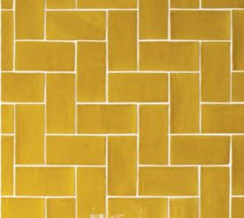
AkzoNobel selected gold for its nod to both